How to Use Textures to Enhance Your Photographs
In this post Patrick Dean from NeutralDay.comexplores how to use Textures to enhance an image.
If you’ve spent anytime at all exploring sites like Flickr,
I’m sure you’ve notice a good many photographs that have a certain
“vintage” look to them, a patina if you will. There are many variations
to this theme, ranging from simple toning to full blown distressing of
the photograph complete with film like grain or scratches and surface
variation resembling an old or imperfect photo. Up till now you might
have thought that achieving this look was difficult and time consuming,
but in fact it is remarkably easy, and it is done using textures.
What exactly is a texture? The term texture when used in photoshop refers to an image that is used on top of your own image that when adjusted via blend modes or opacity imparts a “texture” on your image. The “texture” doesn’t have to be of a physical texture, in fact it could be nearly anything, including another photo. Generally however textures will be photographs or scans of old pieces of paper, fabric, a hand written letter, etc. But it could be a image of clouds, rain drops on a windshield, a bokeh pattern, bubbles, water reflections, and on and on. That’s the beauty of using textures, they could be anything and combined infinitely to create a wide range of different looks.
Of course this variation makes it seem a bit more confusing than it is, but to clear up any confusion I’ve provided a walk through on how to use a couple of textures that make a good photo into a very interesting photo. It’s easy to overdo textures, and I prefer to not stray to far from my original material, but you could take this is as far as you want with as many textures as you want.
For this we’ll be using Photoshop CS4 (any version will do, including
Elements), an original image, and a couple of textures. To acquire your
own textures you can scan or photograph your own, or alternatively,
check out sources like flickr or deviantArt for literally thousands of free textures that you can use in your work. In this case I used a paper texture similar to this one (via flickr member: Feodora Umarov), and a bokeh texture available here (via
flickr member: laughlinc). Both are free to use as textures in your
work under the creative commons license, but by all means browse around
for further possibilities.
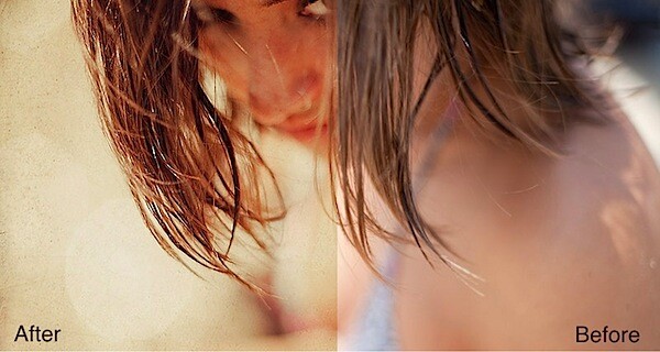
The Original Image
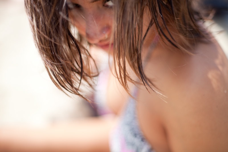
I picked this image because of the brooding mood of the subject and
ample negative space. I really like the photo and the out of focus
quality present, but it could use a little “enhancement”
Step 1
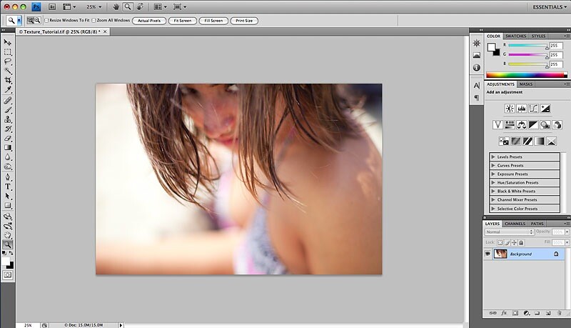
Open up your original image in Photoshop.
Step 2
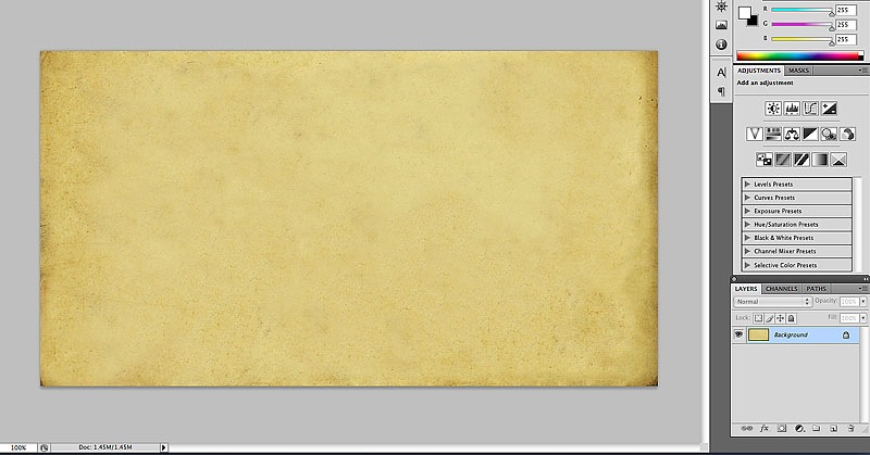
Open up your texture file in Photoshop. Here’s mine, an old piece of
scanned paper. You should now have 2 files open in Photoshop. Drag the
texture file onto your original image file to add it as a layer. For CS4
users, drag the texture layer to the original image tab (if you’re
using the tabs), until the original image is displayed, then let the
texture file go on the original image to add it as a layer.
Step 3
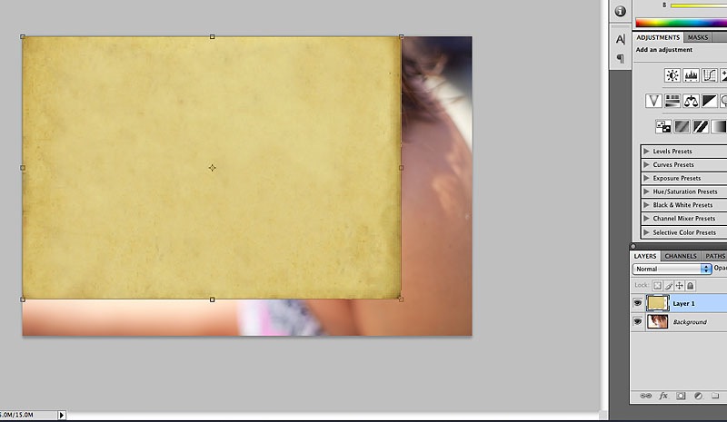
Re-size the texture layer so that it covers your original image
entirely. With the texture layer highlighted in the layers palette, use
the shortcut command/control T to resize the texture layer. Press
“return/enter” to finalize your resize.
Step 4
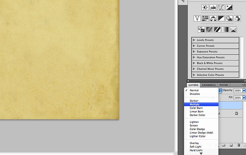
This is where the magic happens. We’re going to change the blend mode
of the layer in the layers palette. Blend modes change how one layer
interacts with the layer/s below it. In this case we’ll start with
multiply.
Step 5
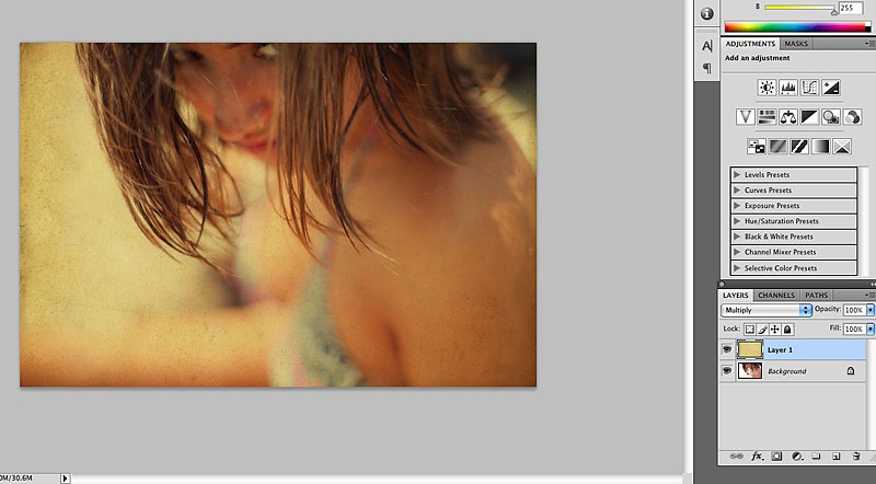
Notice right away we’ve produced a more vintage feel to the image.
This could easily be one direction to go, but lets try another blend
mode.
Step 6
?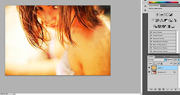
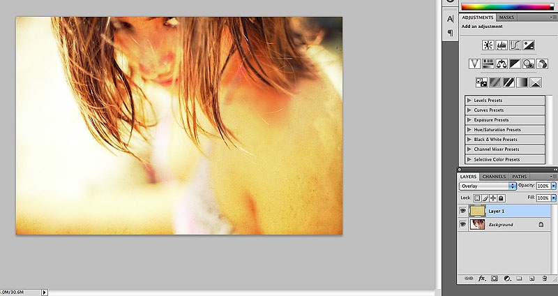
Overlay helps to lighten the image, and though it’s too bright, I
like this direction even more. The beauty of layers is that we can
adjust their opacity and their positions.
Step 7
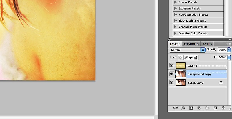
In this step I’ve duplicated the original (background layer). I’ll
use this layer as a “texture” as well, in part to help tone down the
final results. Move the original texture down so that it sits between
the background copies.
Step 8
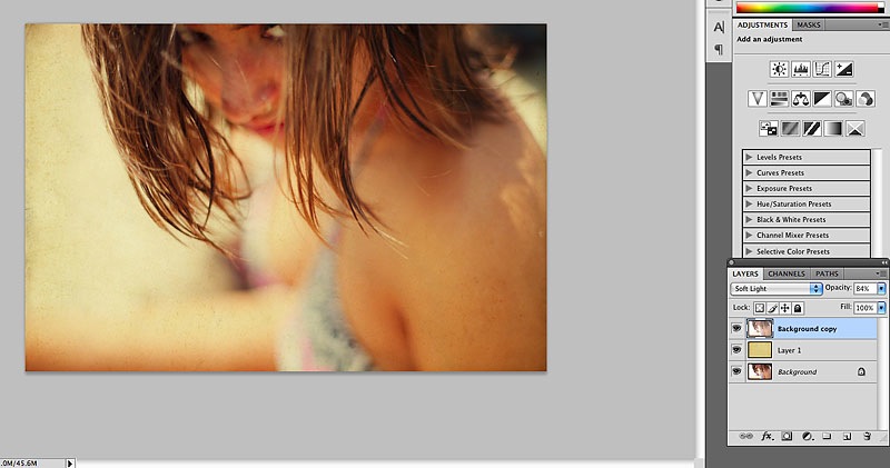
The result of the duplicated background layer placed on top of the
paper texture and set to soft light blend mode at 84% opacity. There’s
no science here, the fun part is experimenting with opacity and blend
modes, and even layer order. But really all I’ve done is add one texture
and change a blend mode and already it’s made a nice change. You could
stop here, but let’s add one more texture.
Step 9
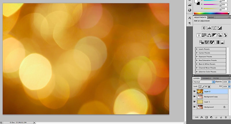
Open up your additional texture (I’m using a bokeh pattern here) and add to your layers by dragging it onto your original image.
Step 10
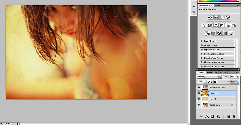
Here I’ve moved down below the background copy layer and the first
texture layer. The blend mode has been changed to overlay with a 33%
opacity. Again, this is the fun part so be sure to try all the various
blend modes to get the look you desire.
Step 11
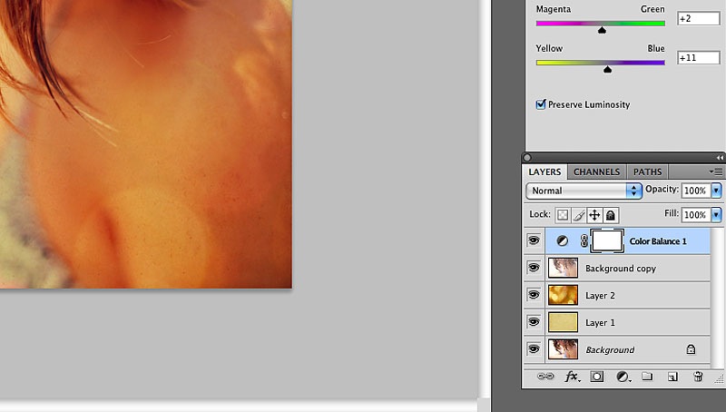
The hard part is done, now just some tweaking to dial in the look
we’re going for. Here I’ve added a color balance adjustment layer in
order to get the red/yellow tones I’m looking for.
Step 12
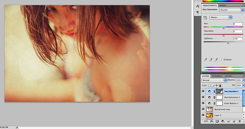
In this step I’ve added a couple of hue/saturation adjustment layers.
One to address the excessive yellow, and one to lighten up the image.
Step 13
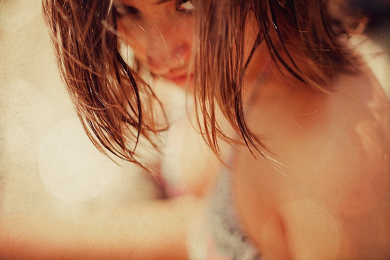
The final image. It has a wonderful tone and atmospheric quality to
it, and I like the overall feel much better than the original. As I said
before, it’s easy to go too far, but you can always go back into the
layers palette and dial down the opacity of the various layers till you
get the right “balance”. What’s great about textures is the final result
looks more significant than the actual process. It’s not for every
image, but the simple process of using textures can add some big impact
to your work.
Patrick Dean is a photographer, graphic designer and editor of the photography news and reviews website NeutralDay.com

